Product design • UX • UI
•
2024
Empowering Patients, Easing Support: Allo Health App Redesign
Allo Health is a health tech company and clinic network focused on providing accessible and discreet care for Sexual Health and STIs/STDs.
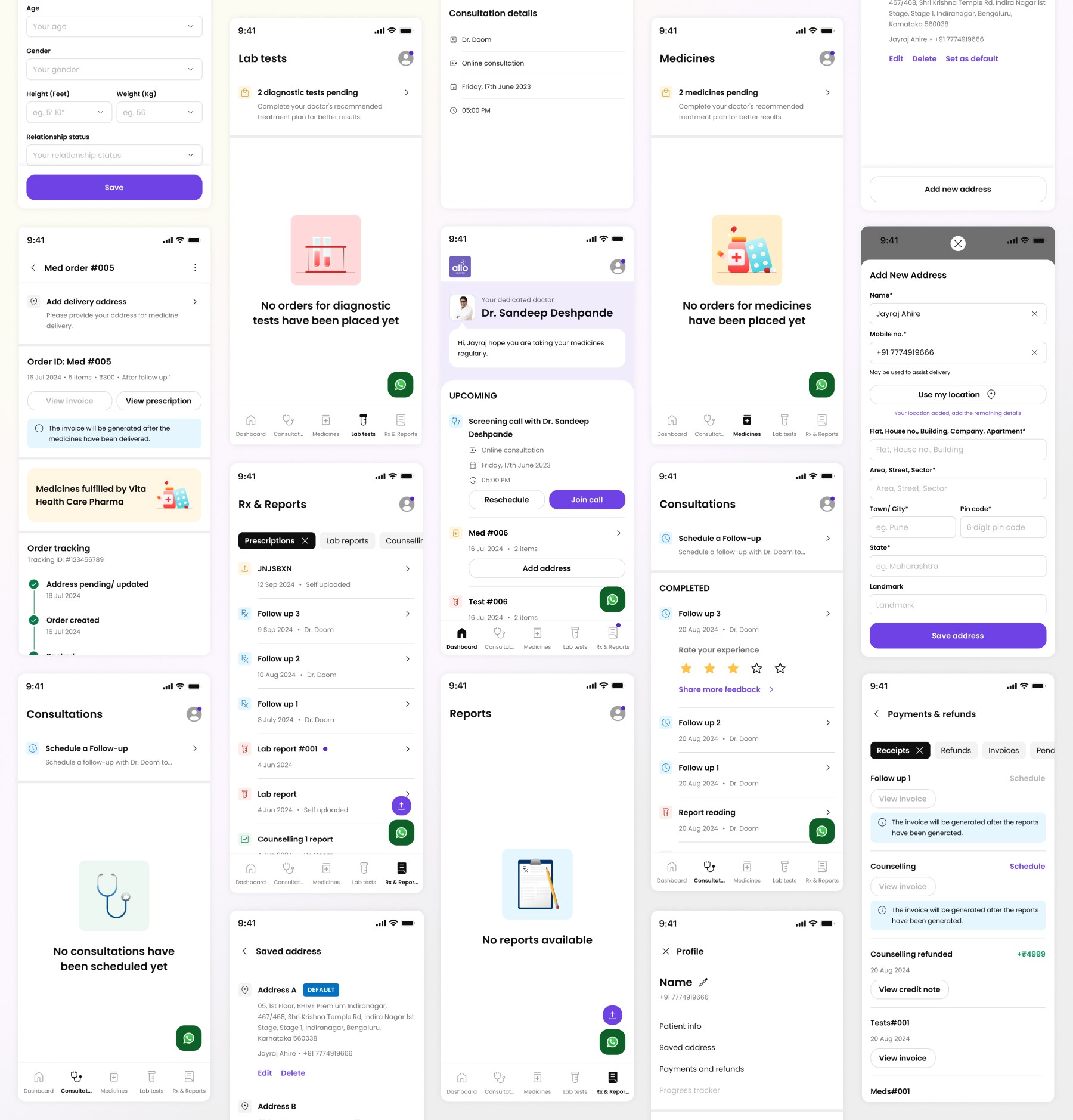
Our patient app serves as a central hub, for patients to navigate their treatment journey with ease. Here users can manage upcoming appointments, access follow-up information, view prescriptions and consultation history, track order fulfilment for the purchased medications & diagnostic tests, and many more.
My Role
As the sole Designer for this project, I spearheaded all design efforts. This involved close collaboration with the Product Manager (Shivam), the Product Owner (Siddharth), and the Developer (Anas) throughout the entire redesign process.
Timeline
Aug - Sep 2024 (Design+Dev+QA+Rollout)
Sep 2024 (User Feedback+Iteration)
Problems
The existing Allo Health patient app presented significant usability challenges, leading to user frustration and increased workload for our support team. Key issues included:
•
Confusing Navigation: Users struggled to find information due to a poorly structured IA and illogical navigation paths. Essential information were often buried deep within the app.
•
Information Overload: The app presented an overwhelming amount of information on single screens. For e.g. the dashboard displayed multiple interactive elements and expanded sections simultaneously, making it difficult for users to focus.
•
Broken Deep Links: Links intended for specific actions, such as order fulfilment, did not direct users on our dashboard, instead we used to send them tracking links from external providers, because the tracking info on the dashboard did not have its own page. This also led to less discoverability & adoption of the Patient app.
•
Unclear Terminology: The app used technical and ambiguous language. Like, "My records" which housed prescriptions, test reports, & counseling reports, While "My Activity" housed consultations, medicines, & test orders – terms that weren't intuitive for patients.
•
Lack of Personalized Navigation/Entry Points: Regardless of their specific goal (e.g., checking an upcoming appointment, or finding an old prescription), all users were directed to the same starting point within the app. This forced them to navigate through irrelevant information, leading to inefficiency and dissatisfaction.
•
App Ineffectiveness: Ultimately, the app's poor usability rendered it largely ineffective. Users couldn't easily accomplish their tasks and frequently resorted to contacting the support team for assistance, increasing operational costs.
Old design
The Challenge & Strategy
As Allo Health evolved from a purely online service to include in-clinic and hybrid appointment models, and plans to expand categories. The existing patient app lacked the foundational structure needed for sustainable growth. To address this, we decided to revamp the app on first principal basis with the following key objectives and strategic considerations:
•
Scalability for Future Growth: We aimed to create an Information Architecture (IA) and a robust structural framework capable of seamlessly integrating upcoming features (already identified on our roadmap and backlog) without compromising the user experience.
•
Improved Clarity and Organization: A core goal was to declutter the app interface and streamline navigation. This involved logically nesting user flows and establishing clear, task-based pathways to ensure users could efficiently achieve their goals.
•
Simplified Maintainability: We prioritized creating a design system that was straightforward for developers to implement and maintain, particularly when dealing with various component states & variations.
•
Addressing Design Debt Proactively: Recognizing the startup's history of rapid iteration, we acknowledged the existing design debt and the eventual need to incorporate industry-standard features. Our strategy was to initially establish a clean, clear, and scalable UX & UI foundation. This plain and accessible design would allow for the seamless integration of new features, with deeper stylistic enhancements for UI planned for a later phase once the core functionality was robust.
•
Future-Proof Visual Foundation: To ensure long-term flexibility, we focused on establishing a basic yet accessible design system grounded in principles like the 60-30-10 rule. This approach allowed us to create a consistent visual structure without committing to a specific brand visual language prematurely, recognizing that brand alignment across stakeholders would be a more time-intensive process to address separately.
The Solutions
Our approach centered on creating a more intuitive and efficient experience by prioritizing clear information organization and user needs. Key aspects of our solution included:
•
Personalized Navigation/Entry Points:
We transitioned from a linear and confusing navigation model to a task-oriented structure, empowering users to quickly access relevant sections based on their immediate needs. For eg. user who wants to view their prescription can directly click on 'Rx & Reports' instead of finding the consultation and finding linked prescription. (PS. they can do that as well)
•
Reimagined Information Visibility:
We introduced a clear categorization of information into actionable states: To-Do, Upcoming, Completed, Purchased, and Missed. This ensured that critical information was immediately visible up-front and easily digestible.
User feedback, gathered during this controlled rollout, was integral to our iterative design process, allowing us to refine the above structure based on real-world usage.
This structured approach also streamlined deep linking capabilities, enabling seamless navigation directly to specific information, such as medicine order tracking or lab test results, via external communications.

•
Simplified and Accessible Content:
We replaced complex medical jargon with clear, everyday language, ensuring that all users could easily understand the information presented.

•
Laying the Foundation for Layouts and Brand Identity:
While the initial focus wasn't on a polished UI, we strategically established the groundwork for a future layout.
We began documenting core brand guidelines and implemented base level principles like the 60-30-10 rule for color and visual hierarchy in this phase. This proactive approach ensures consistency and will facilitate future UI development and expansion once a brand visual language has been finalised, & all the standard UX features are built.

•
Future-Focused Structure:
We strategically incorporated sections to accommodate upcoming treatment adherence features, recognizing their importance in supporting patients and improving health outcomes.
The underlying architecture was designed with flexibility in mind, allowing for the seamless integration of new features and functionalities as the platform evolves.

Everything put together
Outcomes
Impact
While this case study primarily focuses on the design improvements, the user-centered redesign yielded significant positive indirect impacts on the business, including:
•
Significant Reduction in Support Escalations: We observed an decrease in escalations from 81% to 48%.
•
Improved User Efficiency and Satisfaction: The streamlined navigation and clear information architecture empowered users to accomplish their tasks more quickly. This resulted in reduced user frustration and likely contributed to higher brand satisfaction.
•
Enhanced Development Efficiency: The simpler and more organized design system enabled the development team to maintain and update the app more efficiently, leading to reduced development time for future iterations and features. (this was visible when we implemented other flows & features in the dashboard)
•
Strong Foundation for Future Scalability: The redesigned information architecture and flexible structure provided a robust and scalable foundation to accommodate future feature additions and the evolving needs of the business.
Reflection and key learnings
a) Elderly users saying they don’t like to use softwares because it’s hard to use for them, although all of them had smartphones and could use them well enough. This helped us to understand that we have to design interactions in such a way that,
•
They can focus on only one step at a time.
•
Keep the no. of steps to complete the prescription to minimum.
b) In huge redesign project’s such as this, pushing the whole design to prod was not possible within one sprint. But we also couldn’t work for 2-3 sprints and push the whole design to prod at once, as some doctors were moving their workflow to our competitor's. So we defined the design priorities and pushed them to prod in phases.
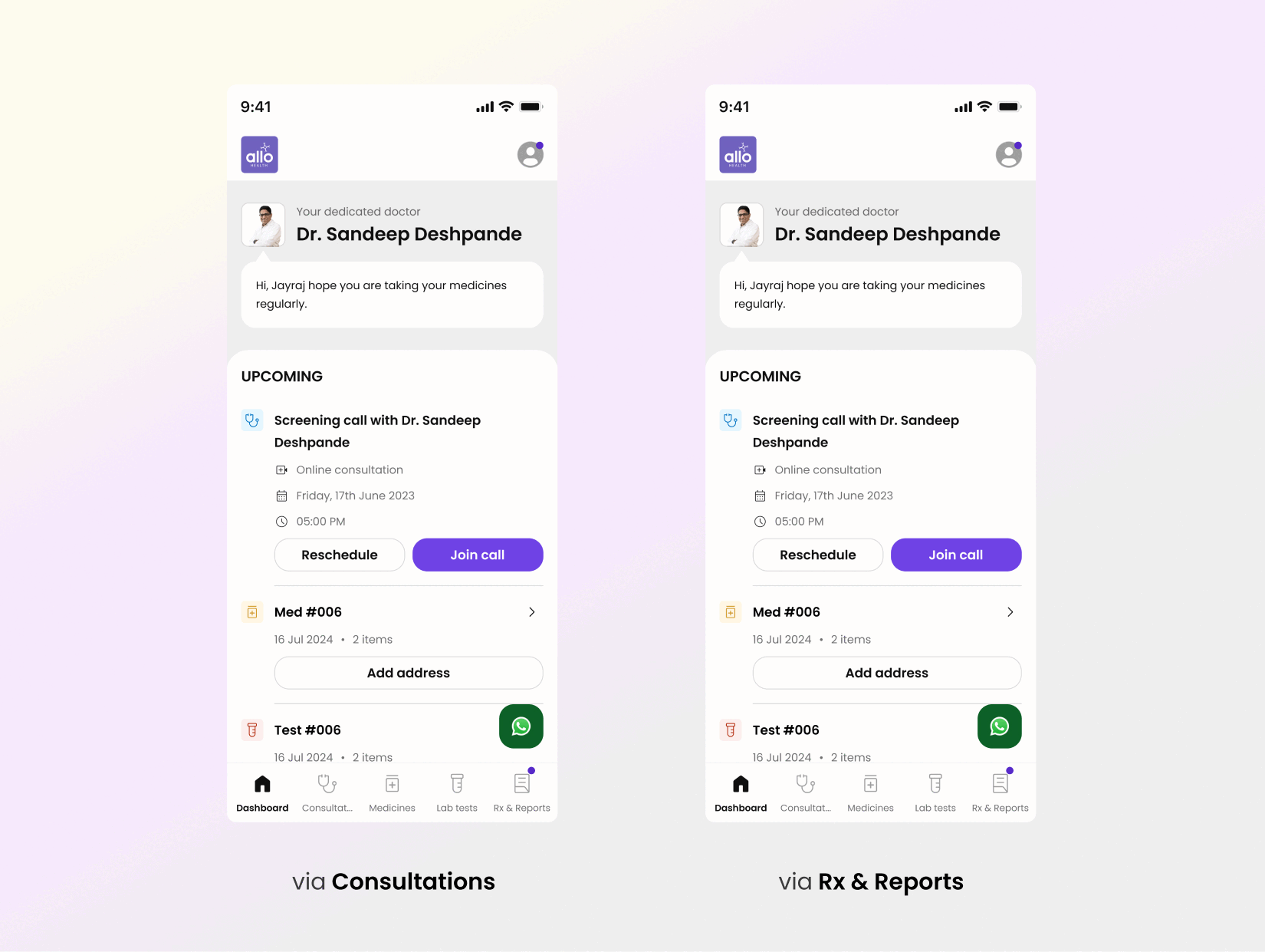
What Could Be Even Better
As this case study highlights the foundational improvements in user experience and information architecture,
•
Another big thing that could be better and part of the roadmap is the discoverability of the Patient App through our website and external communications and messages.
•
The next exciting step is the full realization of the app's brand visual language. As I write this, we are actively developing a well-defined and engaging UI that builds upon this solid foundation. The updated designs promise to further enhance the user experience with a cohesive and visually appealing interface, bringing the Allo Health brand to life within the app. Below are the few snippets.