UX design
•
2022
Redesigning navigation for web
Redesigning the 'Phable for Doctor's' web navigation for improved UX
My role
Solo designer, 1 project manager.
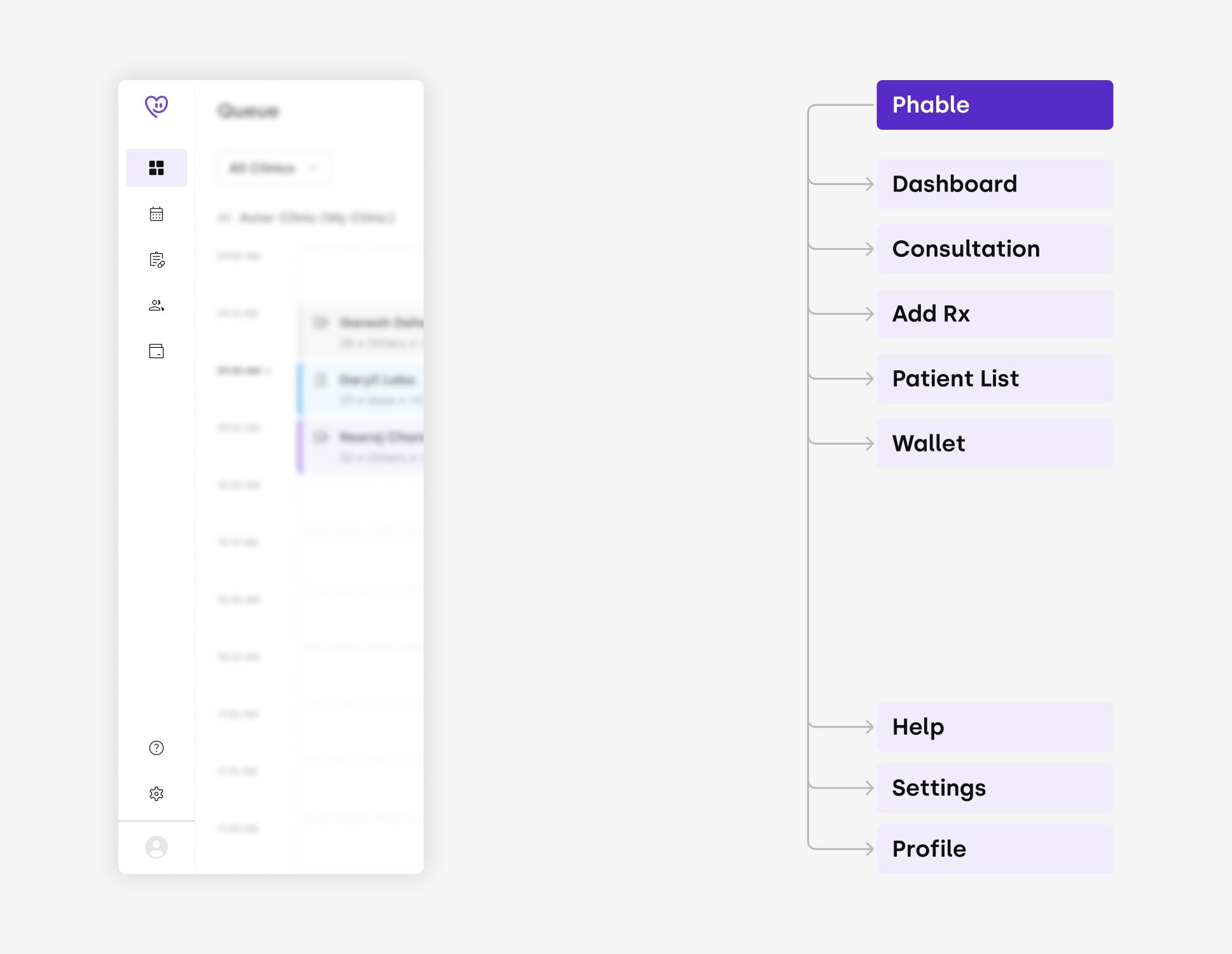
Existing Design and Information Architecture
Why redesign the navigation now?
Our Initial product was inaccessible, but the final push came through when we started getting user feedback
•
No Labels for navigation in web app
New users found it hard to grasp which section does what, because labels are missing unless user navigates to the section.
•
Inconsistency in label names
Label texts were different on Web App when compared with Mobile App.
•
Unscalable Information Architecture
As our product was continuously growing, we had to make sure it was easy to navigate to the desired section. New sections were to be introduced, but current IA was not able to support it.
•
Unscalable UI
Design
Solutions
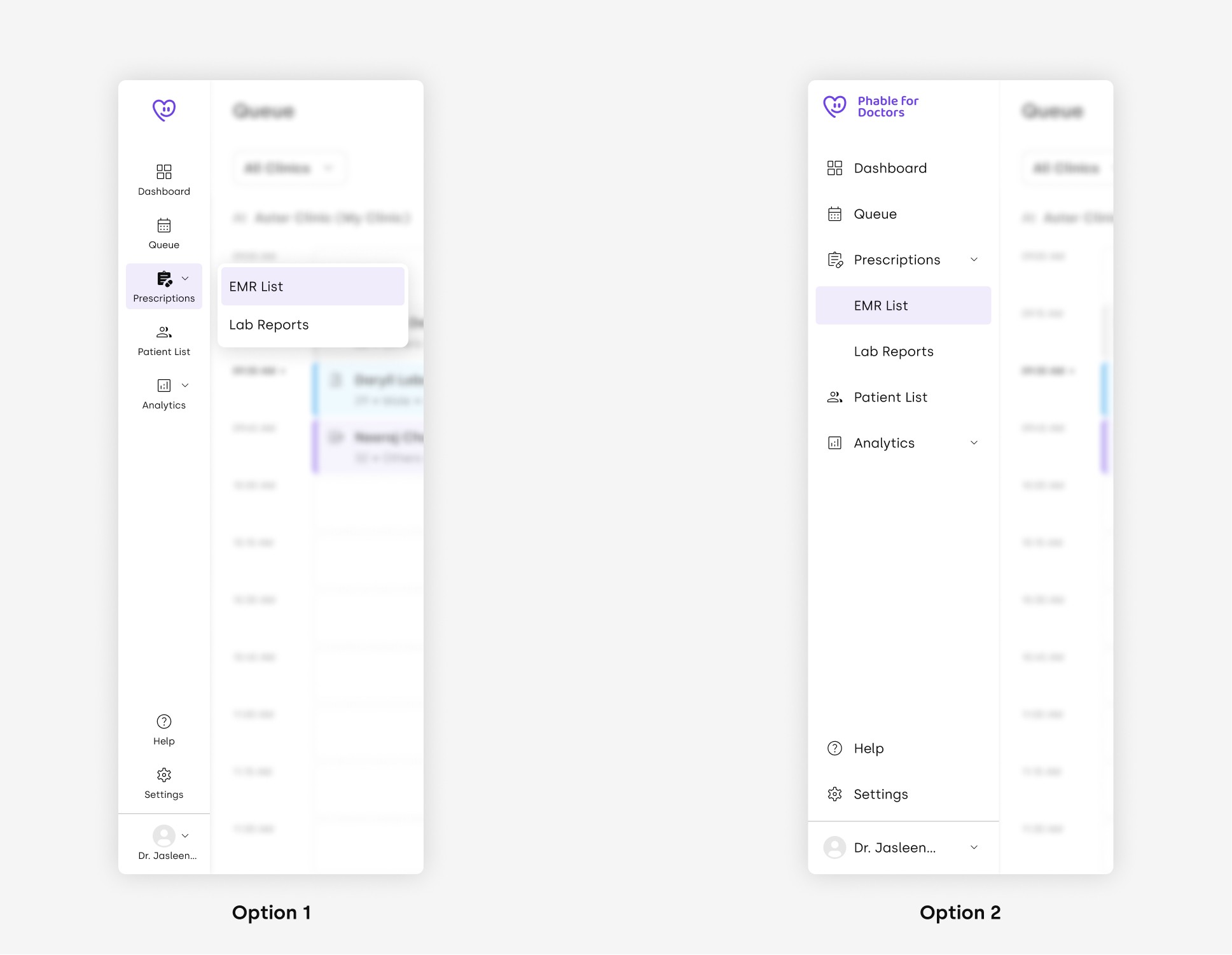
After competitive analysis, discussions with stakeholders, and many iterations later we came up with two options.
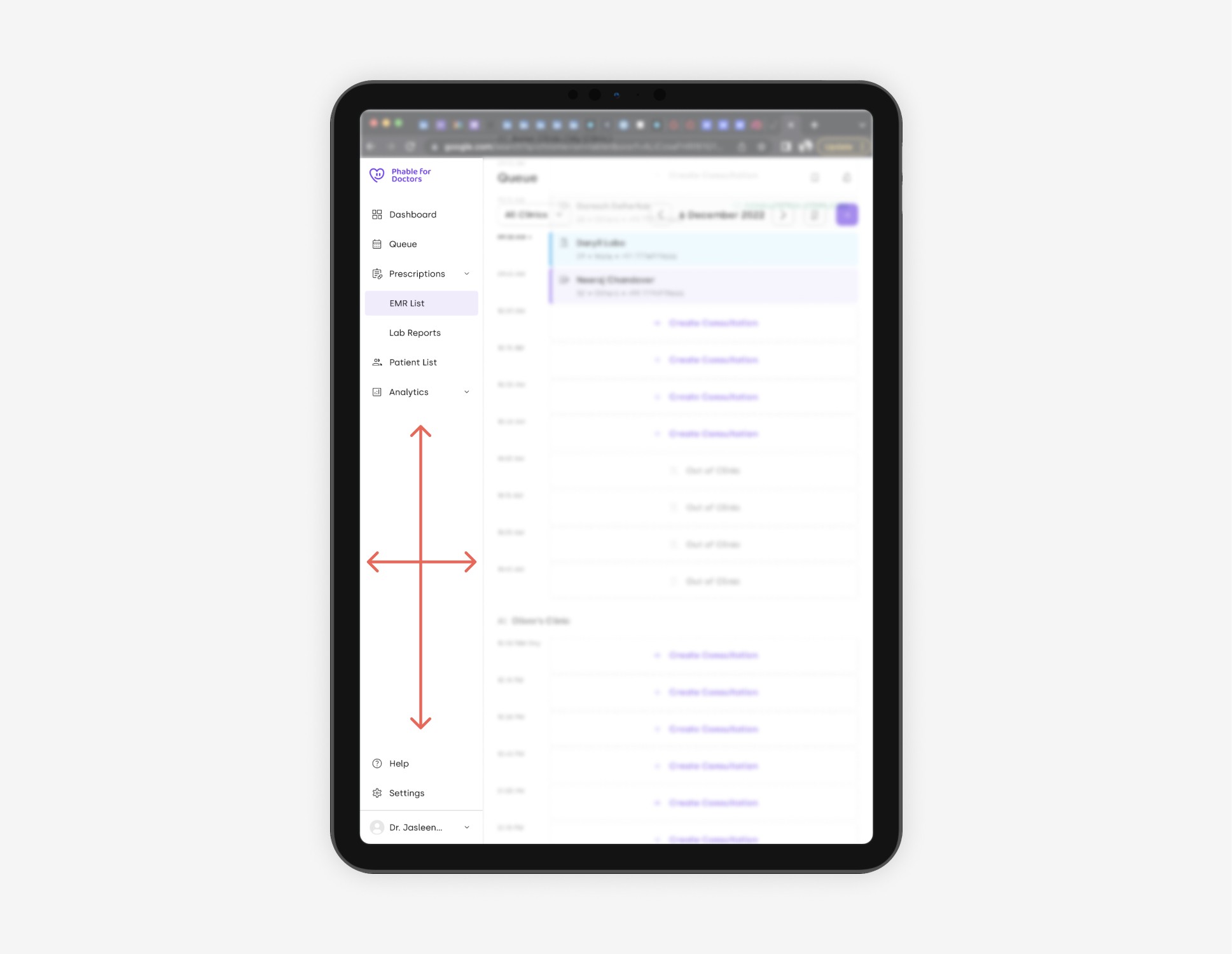
Problem with option 2 was that lot's of screen space is wasted, this is quite noticeable in smaller screens like on tablets.
Final Solution
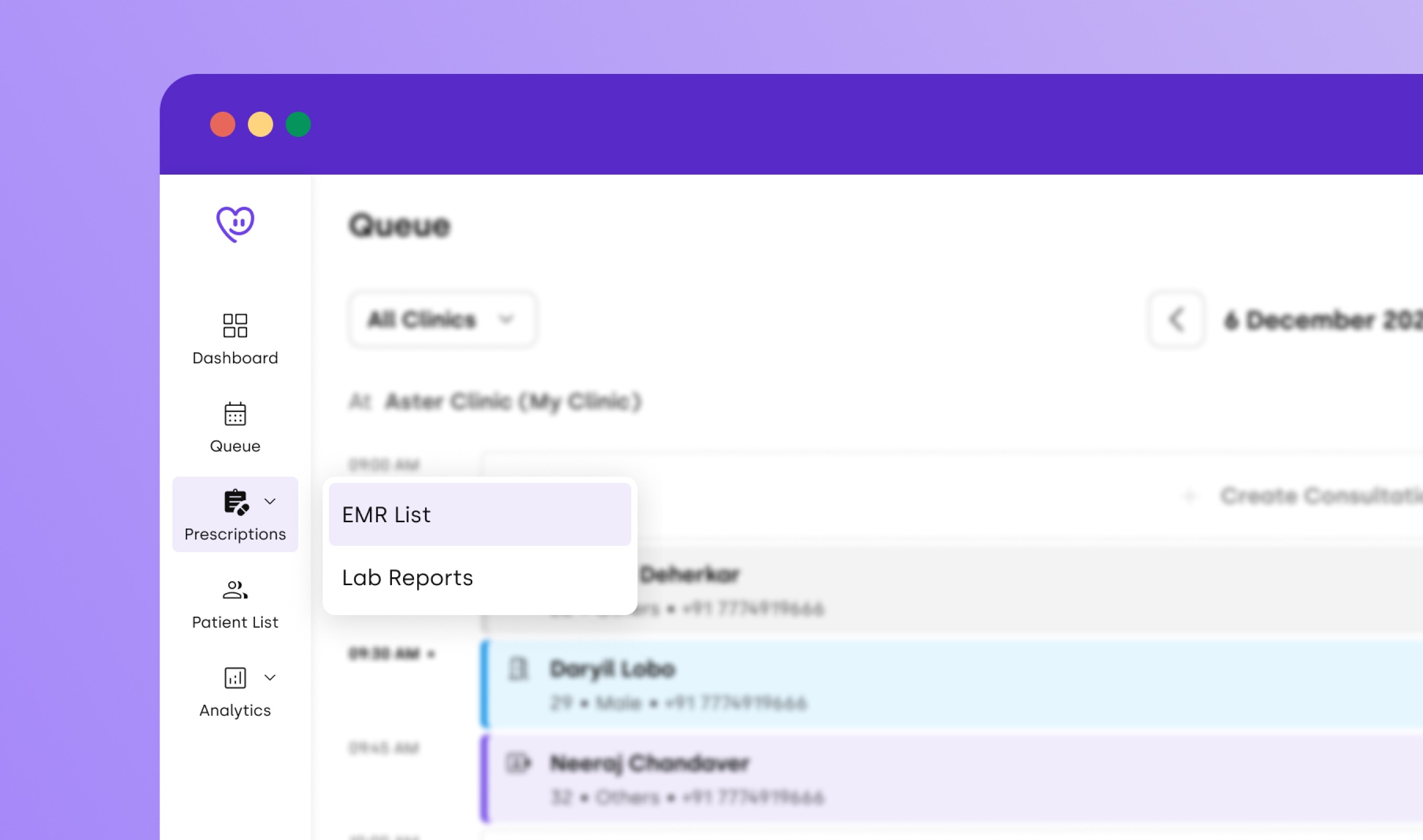
After competitive analysis, discussions with PM, and many iterations later we pushed the new and improved web navigation that will scale just as our product does.
Impact
These new navigation bar now enhance the user experience by
•
Organisation by categories
•
Expanding sub-categories by hovering on the side-bar
•
Enables UI to scale more easily, as the product scales.


