Product design • UX design
•
2022
Redesigning digital prescription module for web (EMR)
Improving usability for digital prescription creation module for doctors, also called as Electronic Medical Records.
Team and my role
I was responsible for redesigning EMR including interaction, user research, and UI.
Objective
User's stopped using EMR module, and instead opted to upload pictures of prescription.
Our goal was to improve usability of EMR and make it efficient by reducing the time it takes for user's to create e-prescriptions.
Process overview
Since this was a v3.0 of EMR we started the process with testing v2.0 > defined pain points > ideated solutions > and tested again
Pain points
We conducted on-field trips to various clinic's, monitored live consultations, interviewed doctors and receptionists. Pain points that we found
•
Cluttered UI.
•
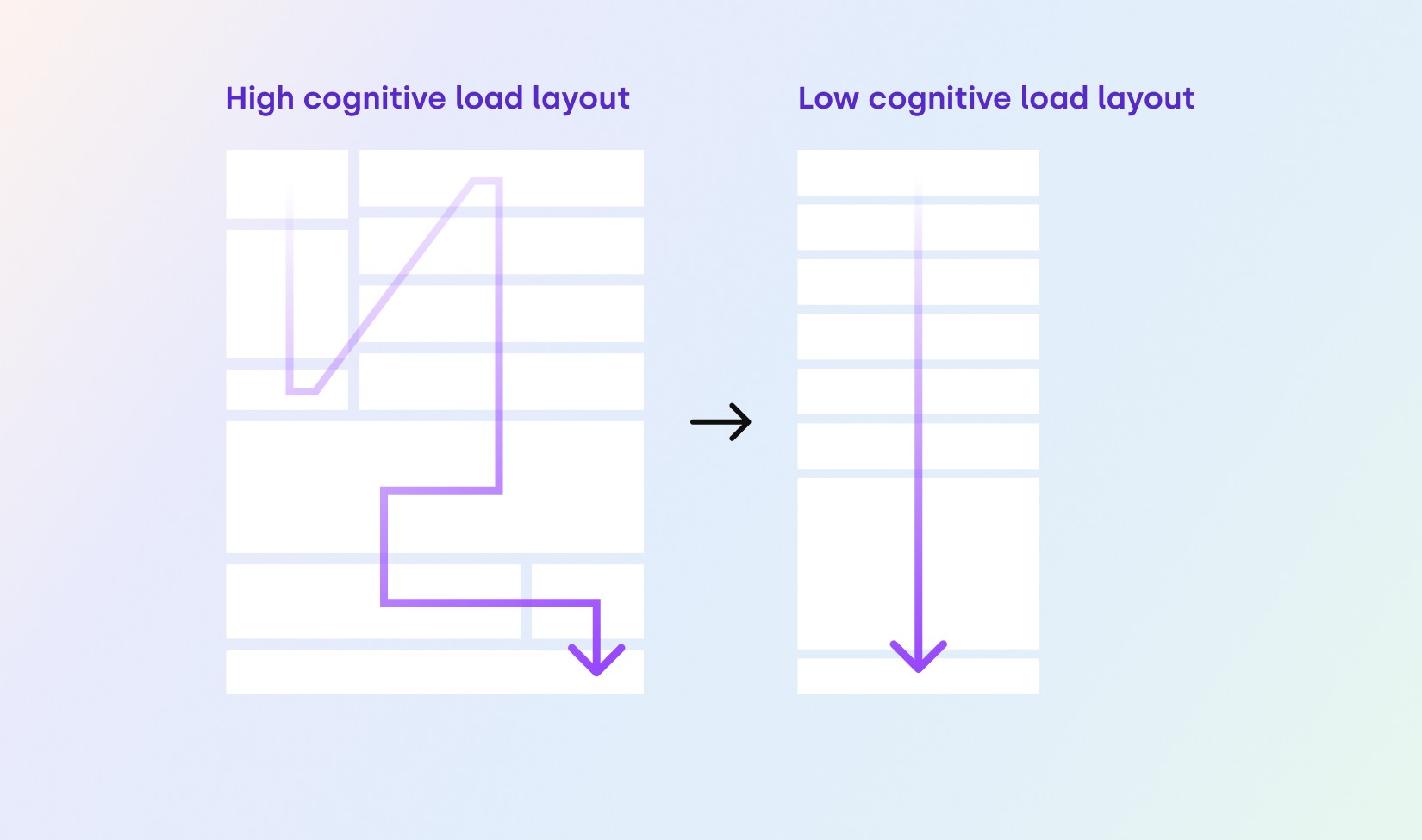
High cognitive load and need for sales person to train doctors and receptionists.
•
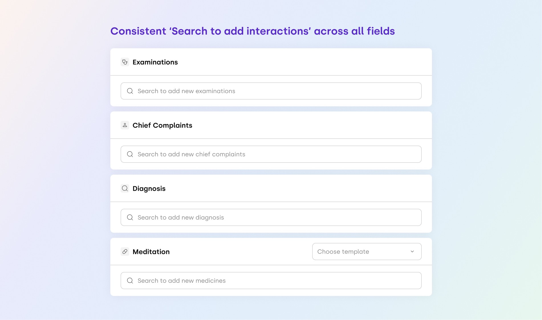
Inconsistent interactions to fill up prescription fields.
•
Filling all the fields in EMR were too repetitive and time consuming.
•
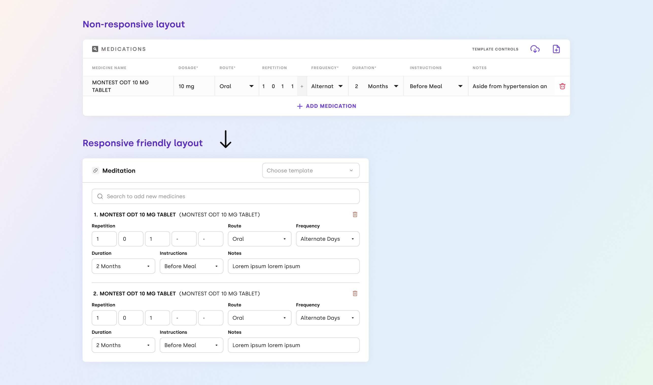
Web UI used to break on tablets.
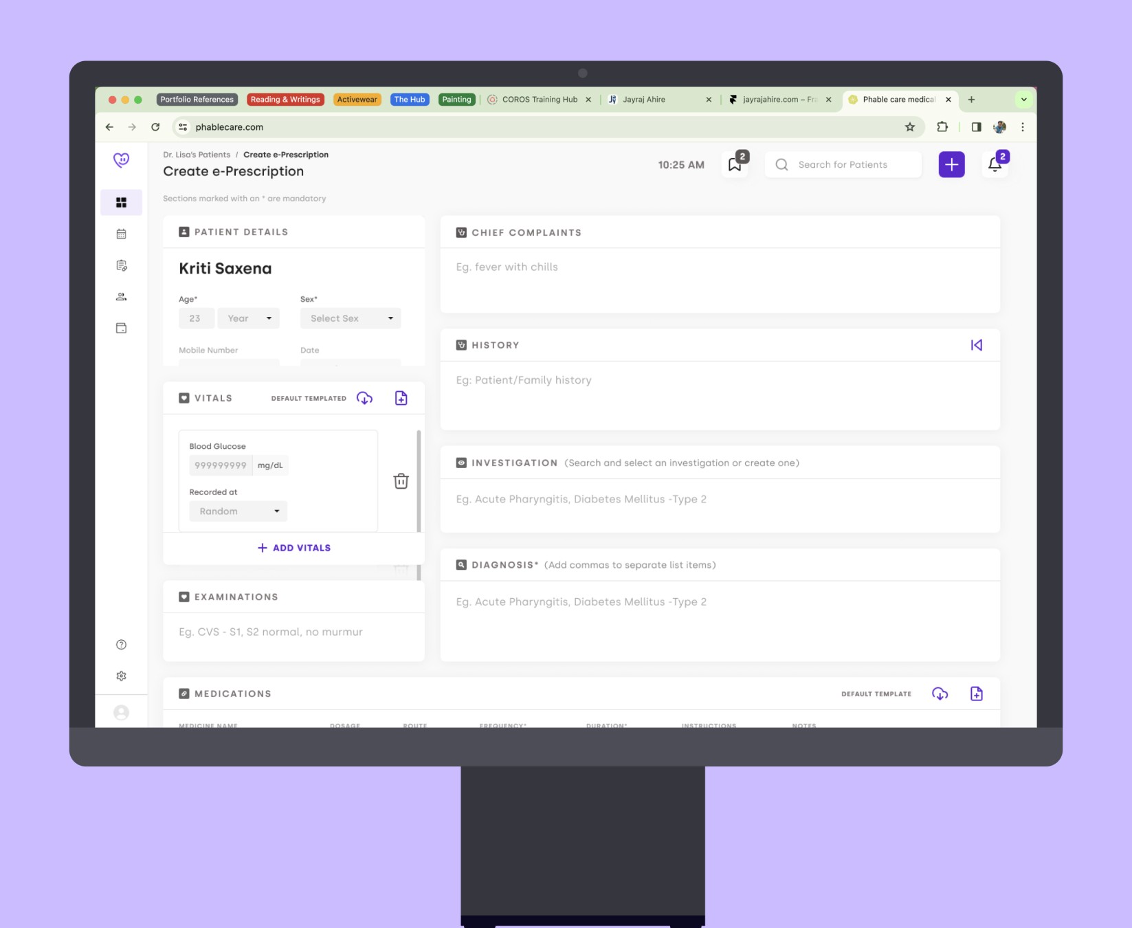
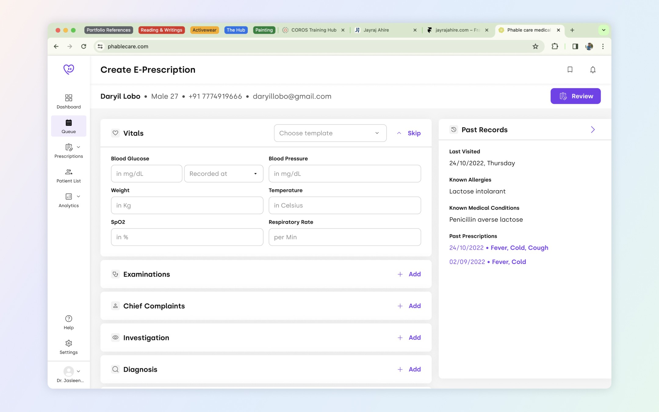
Old design
Hypothesized solutions
•
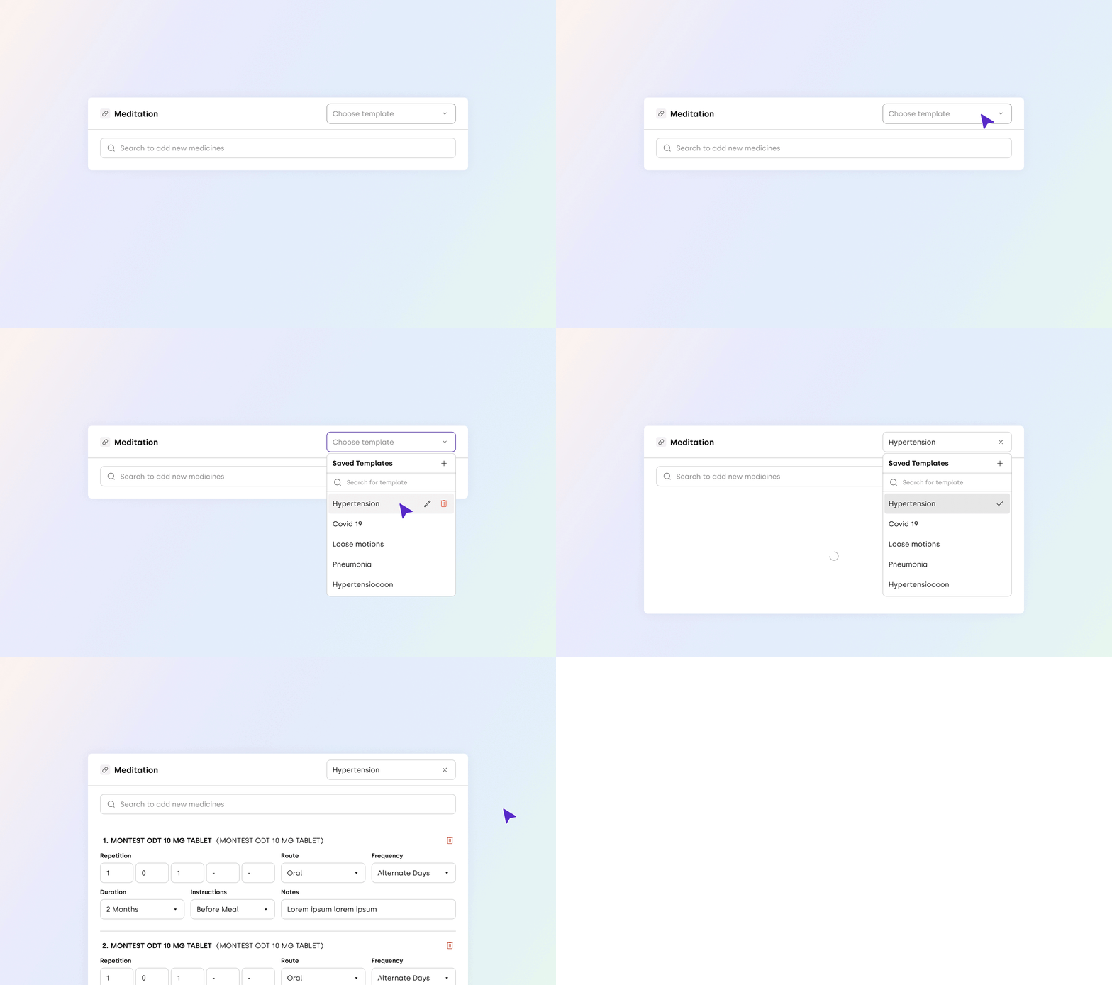
Create a template for common problems and repetitive tasks, and just tweak the contents a little to reduce prescription creation time.
•
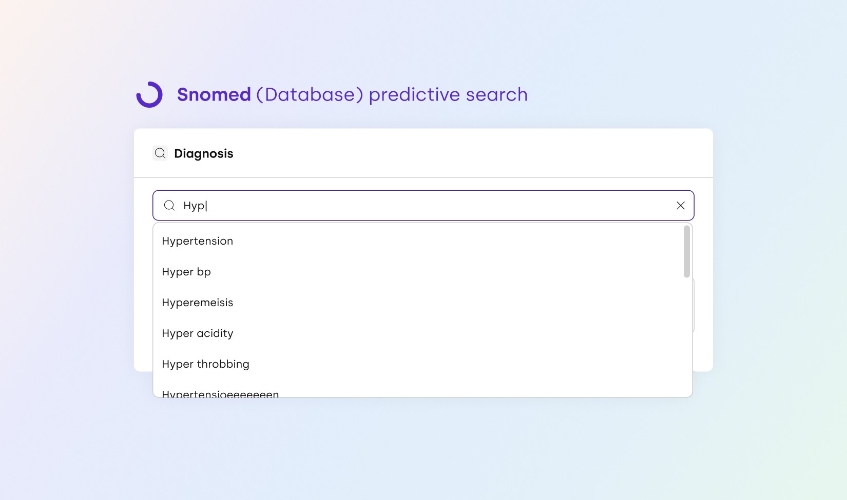
Implementing search results logic, and designing interactions for predictive search (SNOMED our in-house ML, AI dataset).
•
Make medicine section responsive friendly for smaller screens.
•
Change layout to reduce cognitive load on users (applying Occam’s Razor UX Law).
•
Making interaction for diagnosis, chief complaints, medications, and examinations section consistent (applying Jacob's UX Law).
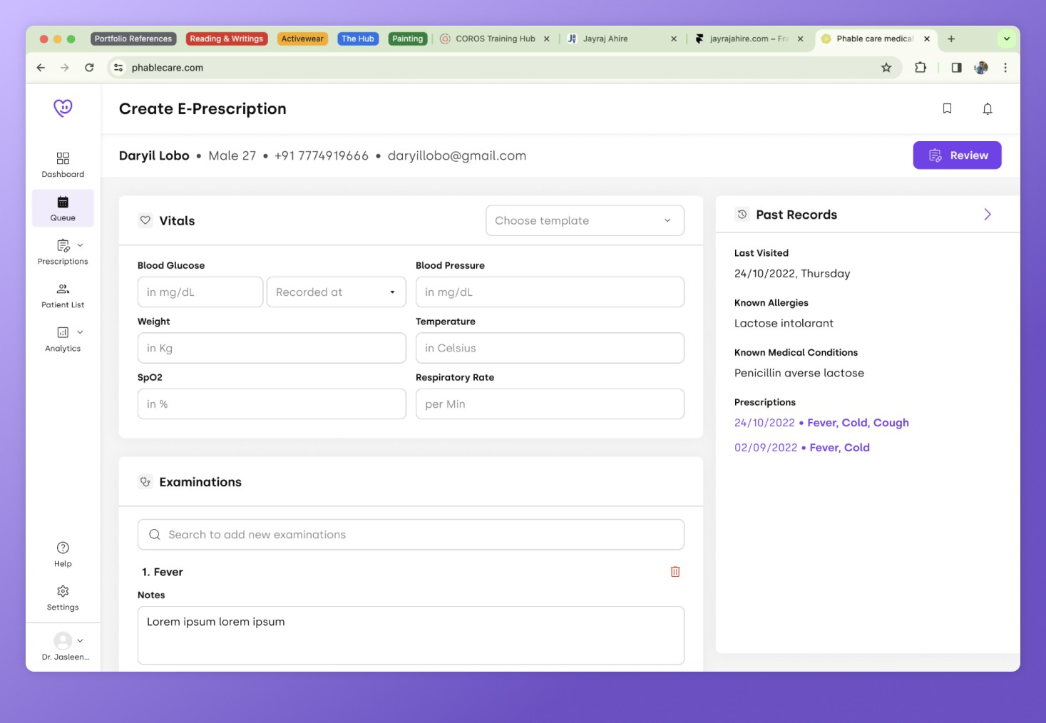
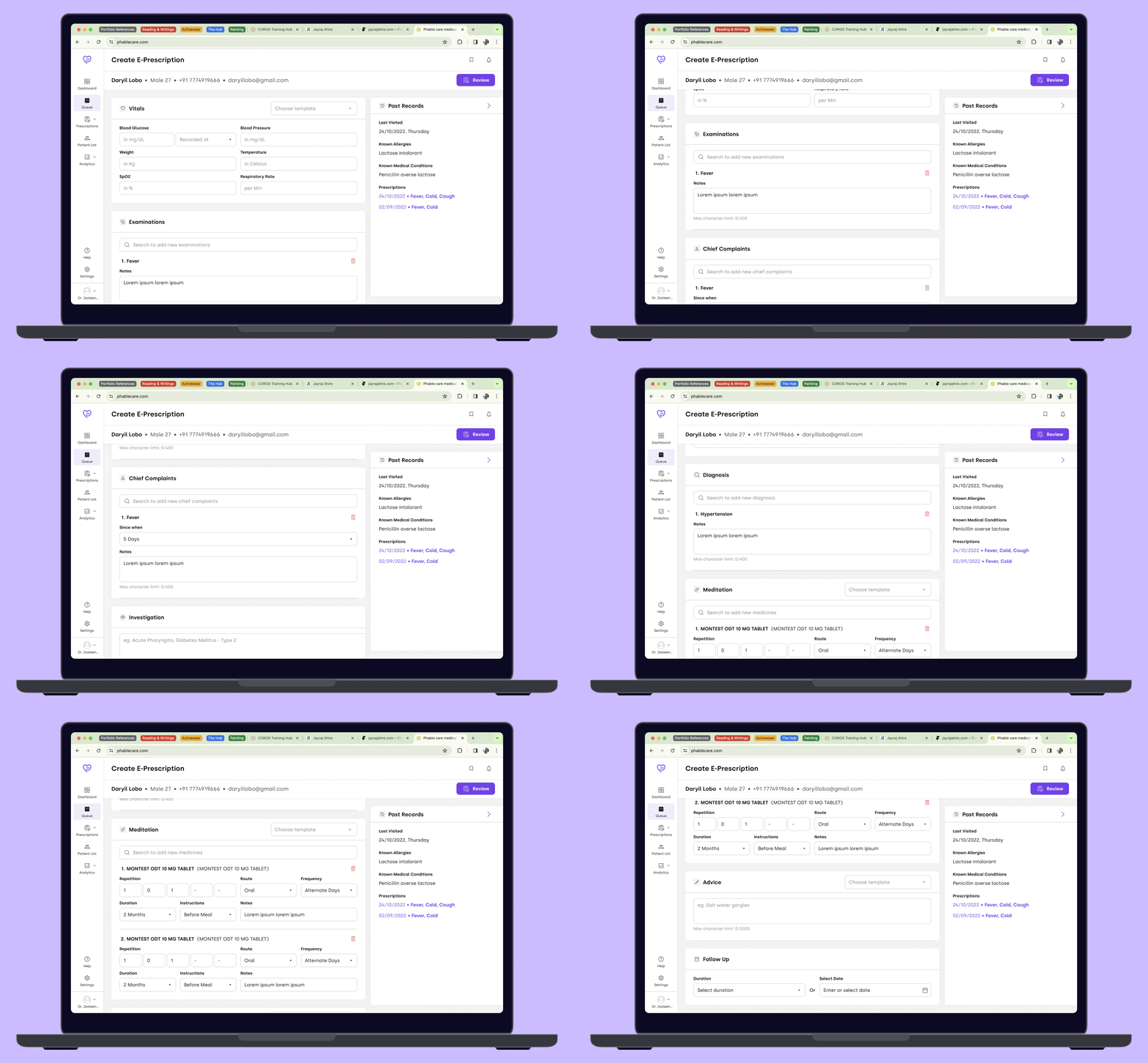
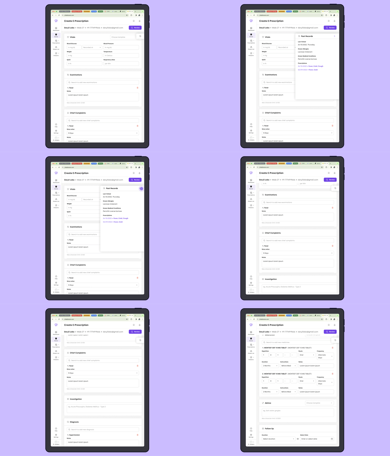
Everything put together
Desktops
Tablets
Outcomes
Impact
•
Reduced e-prescription creation time by around 35-40%.
•
Elderly doctor’s found the EMR module easier to use.
•
And since usage of EMR increased which resulted in decreased uploading of prescription photos, the manual intervention of medical coders was reduced.
Reflection and key learnings
a) Elderly users saying they don’t like to use softwares because it’s hard to use for them, although all of them had smartphones and could use them well enough. This helped us to understand that we have to design interactions in such a way that,
•
They can focus on only one step at a time.
•
Keep the no. of steps to complete the prescription to minimum.
b) In huge redesign project’s such as this, pushing the whole design to prod was not possible within one sprint. But we also couldn’t work for 2-3 sprints and push the whole design to prod at once, as some doctors were moving their workflow to our competitor's. So we defined the design priorities and pushed them to prod in phases.
Going forward
We wanted to AB test the below interactions to reduce cognitive load even more. But unfortunately due to layoffs and company dissolution we never proceeded with the testing.
